
In today’s digital landscape, websites must work smoothly on all devices, from desktops to smartphones. Responsive design is essential for creating a flexible, user-friendly experience across various screen sizes. However, achieving a truly seamless experience comes with its own set of challenges. This blog will discuss some of the key obstacles in responsive design and ways to address them.
1. Understanding Responsive Design
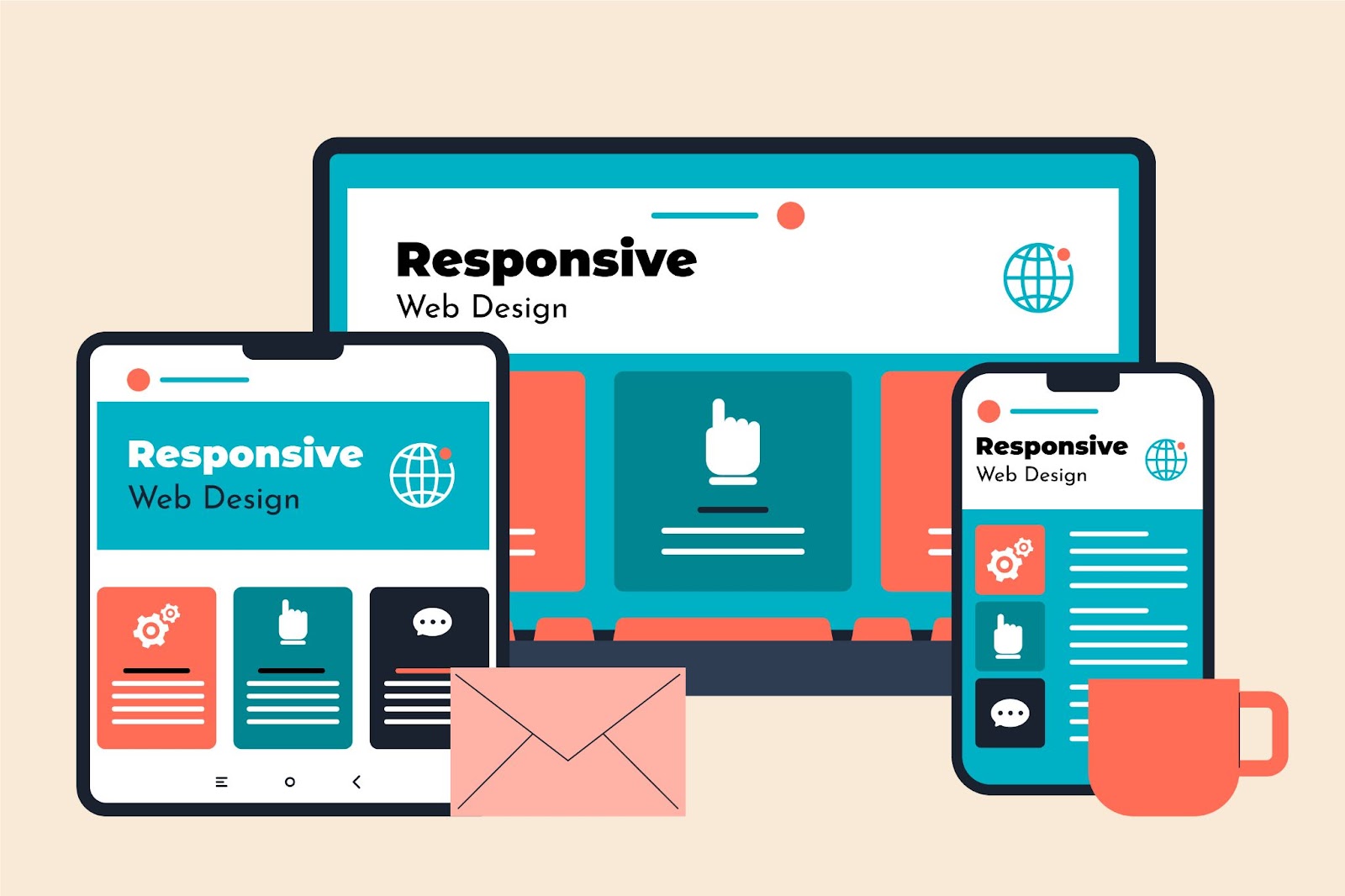
Responsive design means creating a website that adjusts automatically to fit any screen size, whether it’s a desktop, tablet, or smartphone. Instead of building separate versions for each device, responsive design ensures the content and layout adapt based on the user’s device. This enhances user experience by providing easy navigation, readability, and interaction, regardless of the device used.
But achieving this flexibility requires overcoming several challenges. Let’s look at some of the most common ones.
2. Challenge 1: Diverse Screen Sizes
One of the biggest challenges of responsive design is accommodating the vast range of screen sizes. From large desktop monitors to small smartphone screens, each device has its unique requirements. Designers must ensure that the website’s layout, images, and content display correctly and consistently on all devices.
Solution:
Using flexible grid layouts, fluid images, and media queries allows websites to adapt more smoothly across different screen sizes. Testing on multiple devices and using tools like Google’s Mobile-Friendly Test can help identify issues early and ensure compatibility.
3. Challenge 2: Navigation on Smaller Screens
Navigation that works well on a desktop may not be effective on a mobile device. Complex menus, small buttons, or excessive content can make it difficult for users to interact with the website on smaller screens.
Solution:
Simplify navigation by using drop-down or hamburger menus for mobile devices. Prioritize important menu items and ensure that buttons and links are large enough to be easily clickable on touchscreens.
4. Challenge 3: Image Optimization
Images are often a major issue when it comes to responsive design. Large, high-resolution images that look great on desktops may load slowly or appear distorted on smaller devices. This can negatively impact both user experience and site performance.
Solution:
Use responsive images that scale based on the user’s screen size. Implementing techniques like image compression, lazy loading, and using modern formats (such as WebP) can ensure that images load quickly without compromising quality.
5. Challenge 4: Performance Issues
As websites need to accommodate different devices, they often become bloated with unnecessary code or large files. This leads to slower load times, especially on mobile networks, which can frustrate users and increase bounce rates.
Solution:
Focus on optimizing your website’s performance by minimizing CSS and JavaScript files, enabling browser caching, and compressing files. Additionally, using a content delivery network (CDN) helps deliver content faster by serving it from servers closer to the user.
6. Challenge 5: Consistent User Experience
Maintaining a consistent user experience across devices can be difficult. The way users interact with a website on a desktop differs significantly from how they interact on a smartphone. Ensuring that the experience feels intuitive and seamless across all platforms is crucial.
Solution:
Prioritize essential features and ensure the core functionality is consistent across devices. Test how users interact with your site on different devices to identify areas for improvement. Keep the user experience at the forefront by making sure your website is intuitive, accessible, and easy to navigate on all platforms.
7. Challenge 6: Testing Across Devices
Testing is one of the most time-consuming challenges in responsive design. With the vast range of devices, operating systems, and browsers, ensuring that your website works seamlessly on all of them can be a daunting task.
Solution:
Use emulators and simulators to test your website on different devices and browsers. However, physical testing on actual devices remains the most reliable way to ensure compatibility. Make use of cross-browser testing tools like BrowserStack or LambdaTest to streamline the process.
8. Challenge 7: Content Prioritization
On smaller screens, space is limited. It’s crucial to prioritize the most important content while ensuring a balance between text, images, and interactive elements. Overloading the mobile version of a site with too much content can overwhelm users.
Solution:
Adopt a “mobile-first” approach when designing your website. Start with the essential content for mobile and then gradually enhance the design for larger screens. This helps ensure that the mobile version of your site remains clean, easy to navigate, and focused on what matters most to your users.
9. Final Thoughts
Responsive design is no longer optional—it’s a necessity. With more users accessing websites from mobile devices than ever before, ensuring a smooth, seamless experience across all devices is critical. By addressing these common challenges, you can create a website that looks great and functions flawlessly, regardless of the screen size.
If you’re struggling with responsive design challenges or need professional guidance, we’re here to help. For more information on our web development services,
visit us at Talent Corners or contact us at 📞 91688 42889. Our team of experts will ensure your website provides a seamless user experience across all devices.

